So these are my shoes and the first was meant to be a little bit detailed and then less and less until you have a pretty abstract shoe. My shoes could have taken up more space on the page and it would have looked cooler and I think my lead strokes could have been more pronounced.
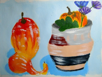
This is my final acrylic and I don't really like it as much as my second because I think I kind of messed up on the highlights on the fruit/vegetable things and I made them look like they are attached a little bit because I couldn't really get the colors right. I still like this one though.
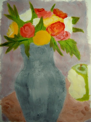
This was my second acrylic and it's of some flowers in a vase with an apple beside it. I like this one a lot better. At first though, I was having a lot of trouble making it look how I wanted it to, but after some guidance from Mr. Meserve, I finished it up pretty well.
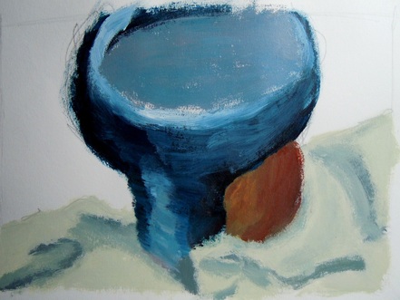
This is my first acrylic for this class and it's pretty crude since this was supposed to be done in one class period. I was painting a ceramics bowl kind of thing with an apple behind it, all on top of a rag.
This is my second still life and it looks like it could have turned out better than my first if I had been able to finish it. I did not do anymore outlining, but I wasn't able to finish it with shading and shadows and a background. I think it though.
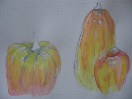
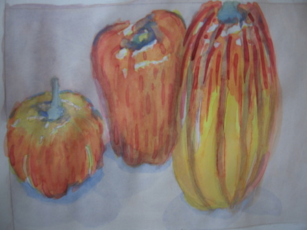
My second watercolor turned out better but it still lacks the quality that I would have liked it to have because I was still outlining at this point. I learned not to outline after outlining both my apple and gourd/pumpkin/squash thing, but my pumpkin looks nice.
This was my watercolor before we had the lesson on how to do watercolors and don't think that it turned out all that well. I think that it looks more like a stained glass window thing because of all the outlining I did, and I didn't leave any white so it looks a little weird.

This is my value drawing of a crumpled up piece of paper. Personally I don't think it looks much like a crumpled up piece of paper at all, but, according to Mr. Meserve, that is what it is supposed to look like. At first I wasn't darkening up the lines enough but once I did that, it looked better. Then as I began erasing some of the white parts to make them more white it worked even better.

I really like this one. I think that all of the color really made this type of art pop and you can see the illusions better. I could have improved on this piece by doing more trickery with the illusions and by having less white, but other than that, I like this piece.

This drawing turned out okay, I think. I definitely overlapped my items and there is some perspective along with chairscuro. Of course, my drawing skills in general could be improved upon and I should have used darker lines when drawing so that it is easier to see everything that is going on.
